"creativity takes courage."
-HENRI MATISSE
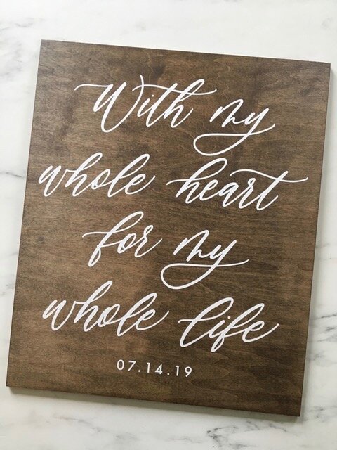
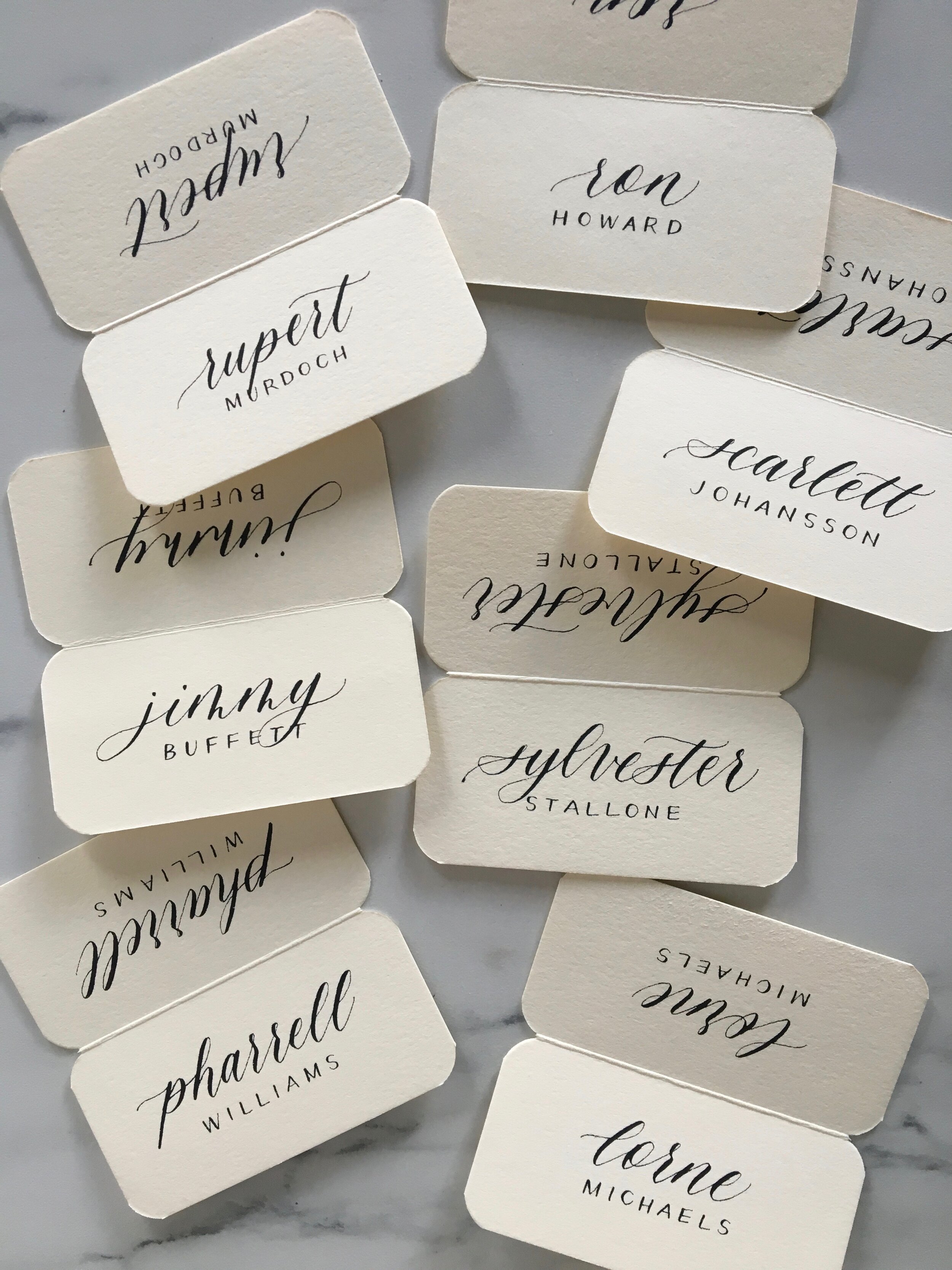
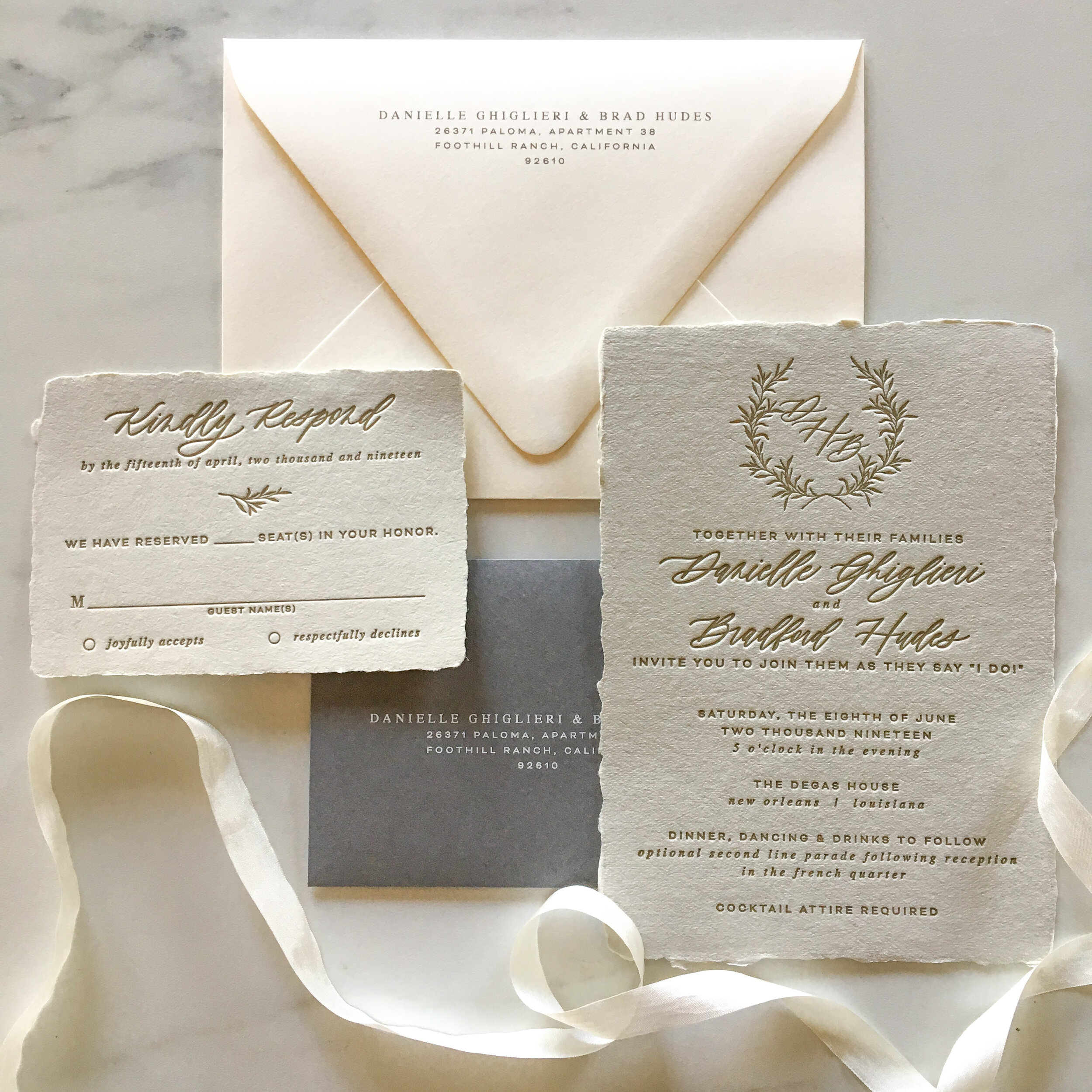
It has taken miles of ink to create signature styles that I consider my own, and they are always improving & evolving.
While I do offer others looks, these are considered classic favorites. I will continue to add to this collection as new looks inspire me & are mastered. In the meantime, check out | INSTAGRAM | for samples of other styles & fonts.
If you are interested in customizing a font, please | CONTACT | me directly.
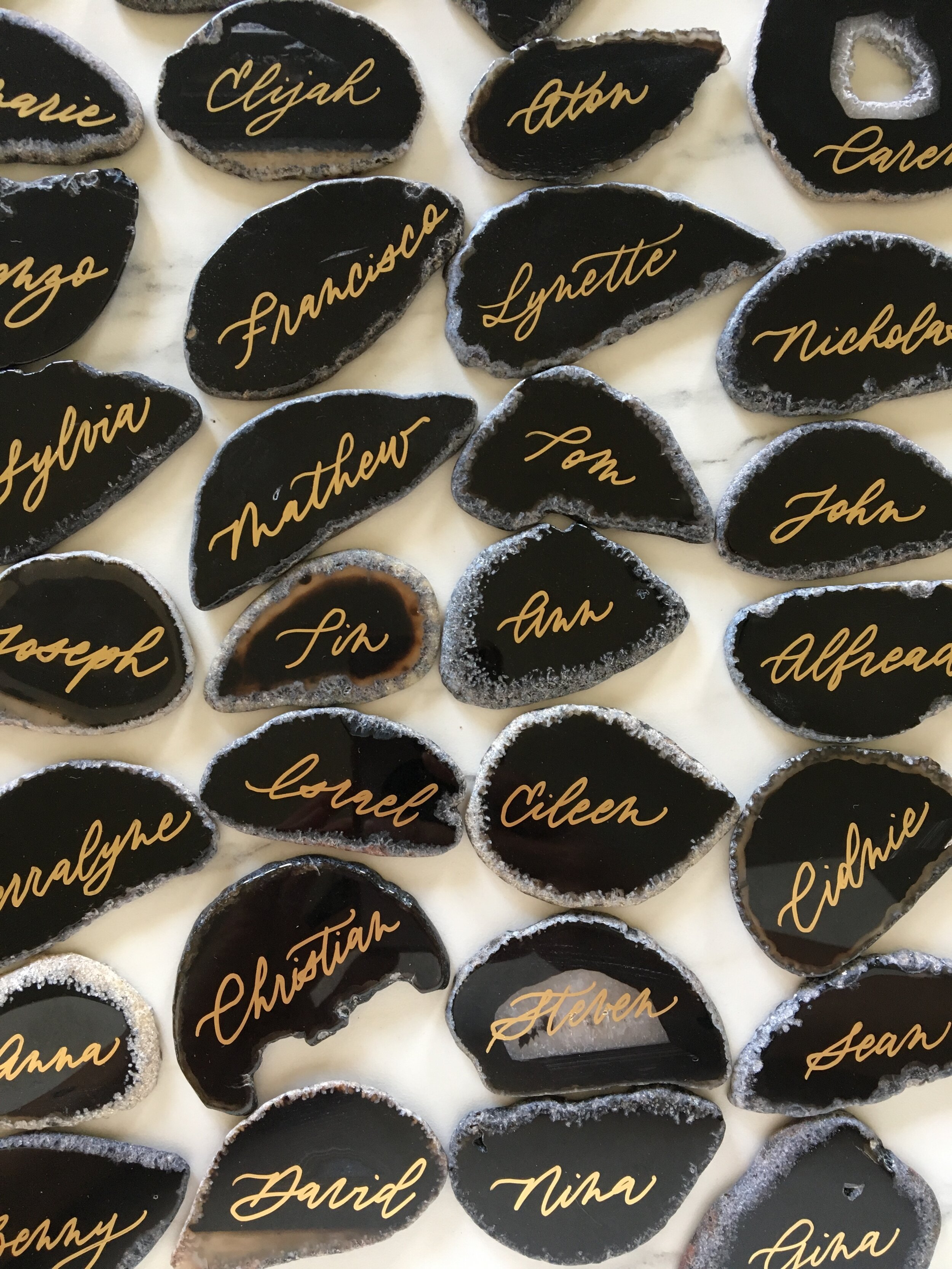
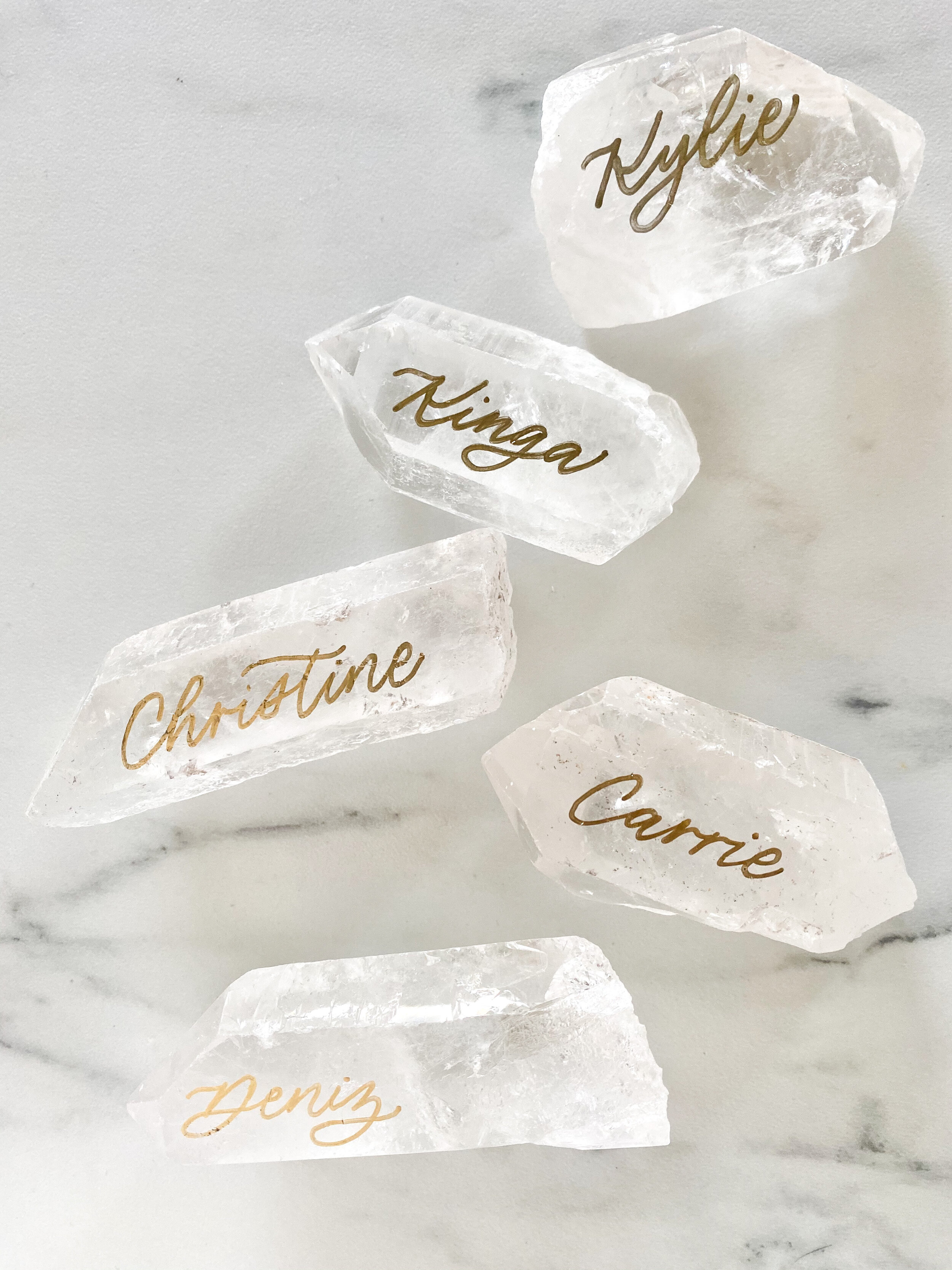
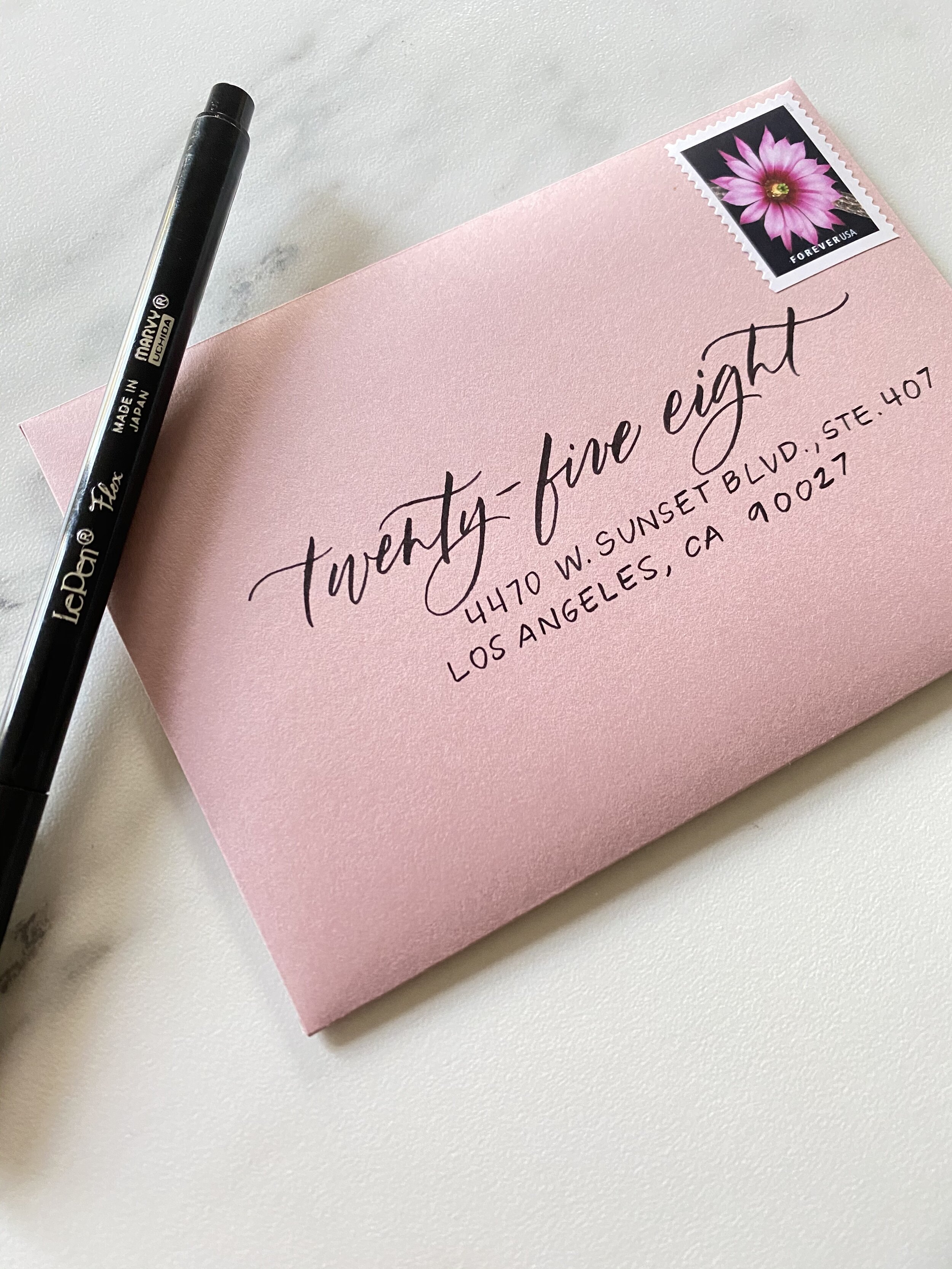
CATALINA: a classic
One of the beloved offspring of my first calligraphic style, the CATALINA style is an absolute classic.
Letter size & spacing are somewhat even, but the overall look still has the dynamic character & form that make it exciting to behold.
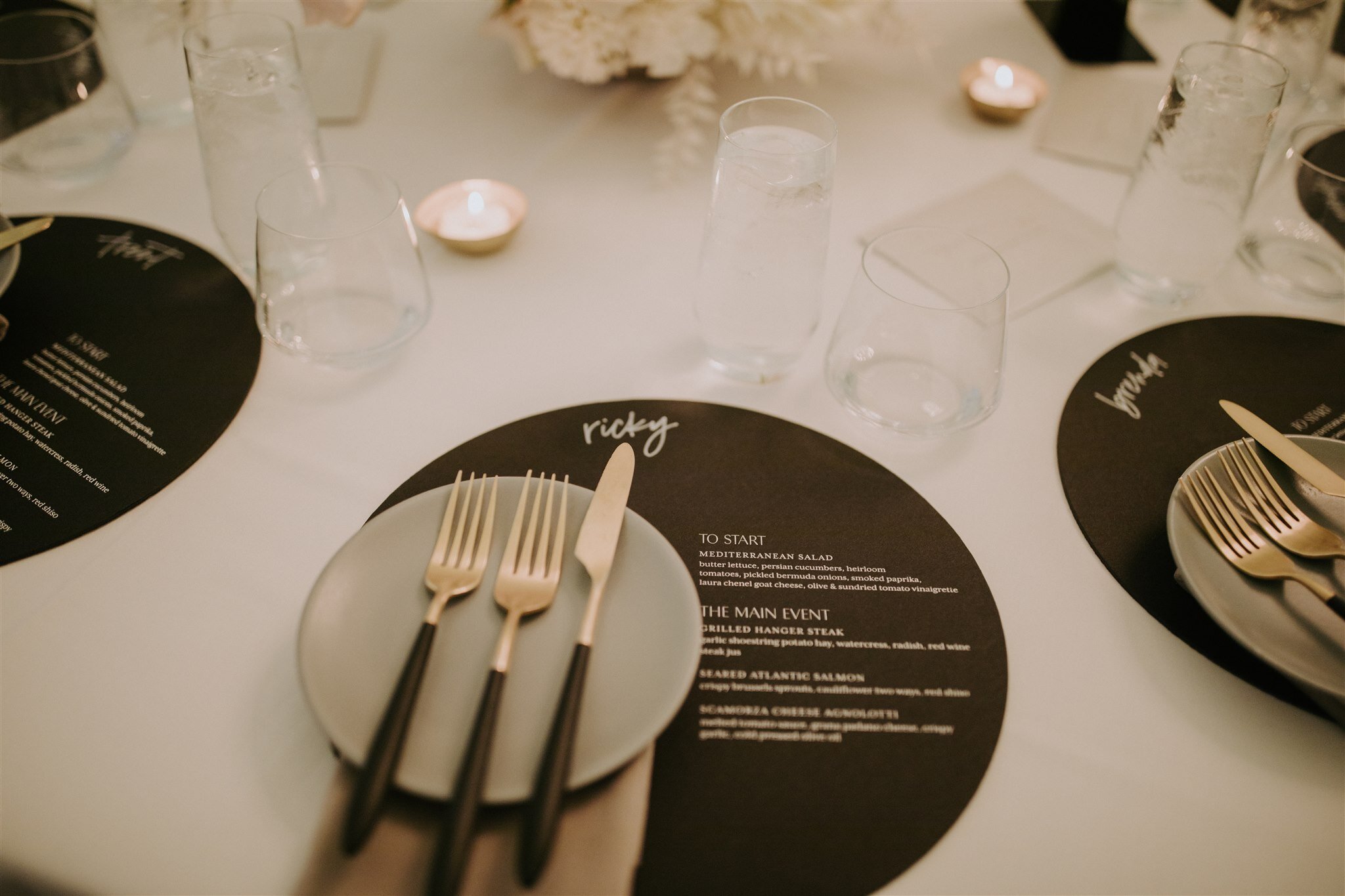
Much like a good LBD, it can dress up for a classy event, or dress down for a more fun & free-spirited feel. Flourishes complement this font well to feel a little extra-fancy.
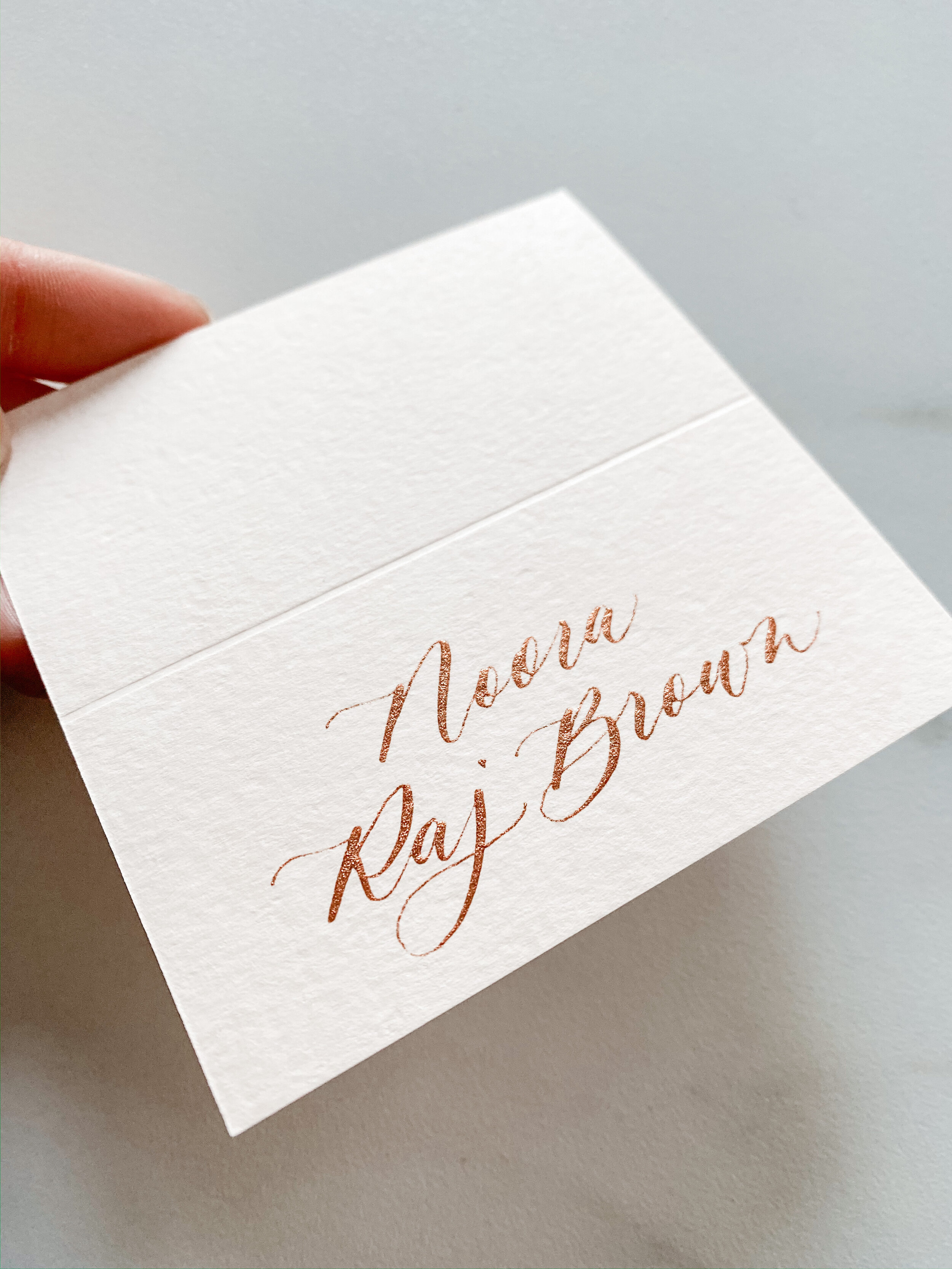
MONTEREY: ethereal & elegant
A new favorite for elegant affairs, MONTEREY is an evolution of Catalina, with some intriguing updates.
You’ll know MONTEREY from the lead-up into the n’s, simplified r’s & long, flowing cross lines on the t’s.
There’s a certain grace captured visually in this style that is felt by its ethereality, and makes it one of our faves.
OJAI: edgy & elongated
OJAI has a bit of a wild side.
Deep italicization, lots of variation & elongated lines make this style feel edgy & free. Clients love using OJAI in bohemian-feeling celebrations to add some visual interest to signs & stationery.
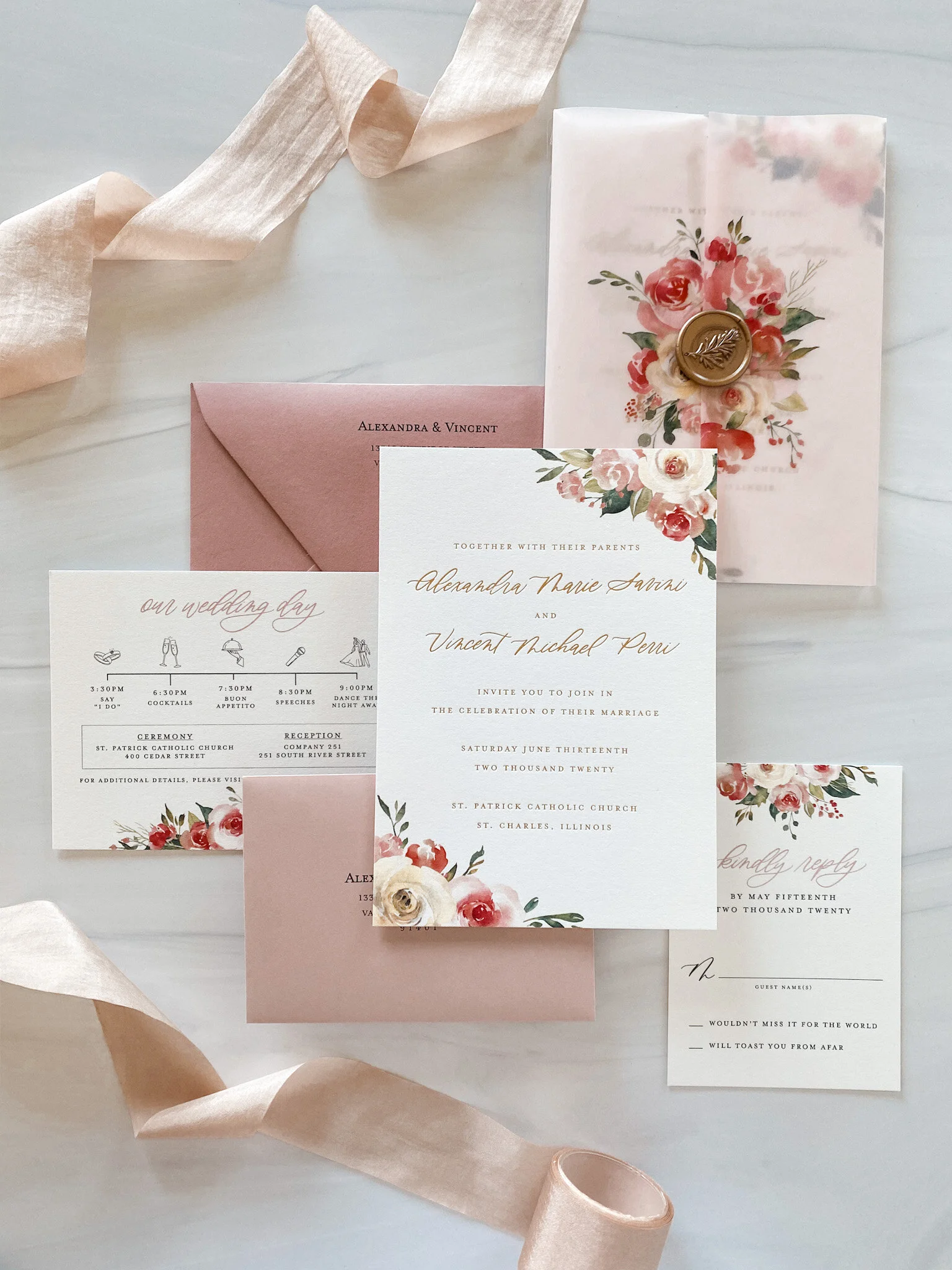
CARMEL: romantic & graceful
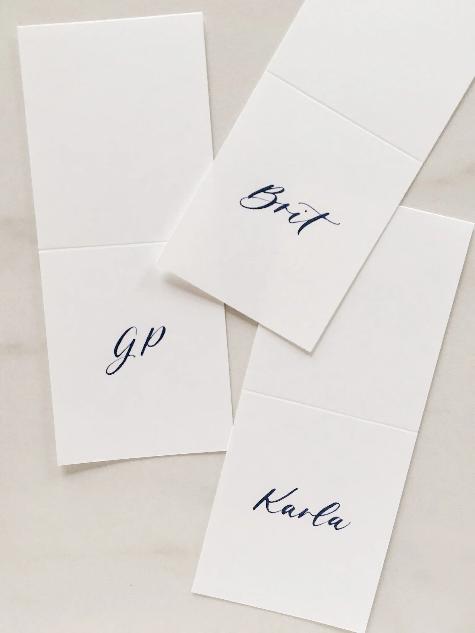
Another evolved version of my classic Catalina font, CARMEL is just plain lovely.
It most closely resembles the same font I used on my own wedding invitations, and to this day, I think it's the perfect font to grace the front of a wedding invitation's envelope. It's flowy, sweeping & simply romantic.
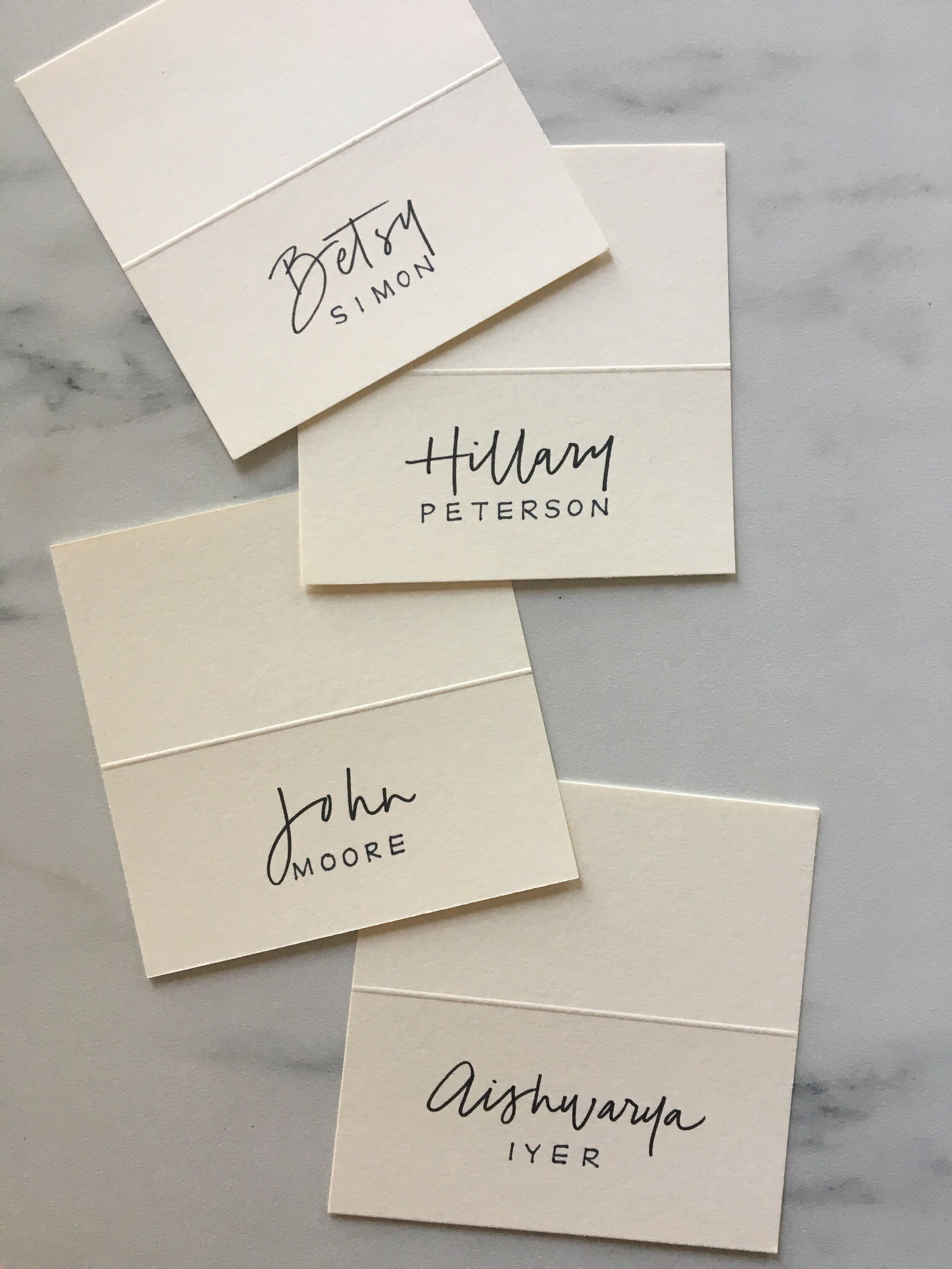
MONICA: modern & relaxed
An easy-going, hand-written feel makes MONICA a personal touch that’s just not stuffy.
Typically designed to be a monoline font (no variations to the width of the strokes), this style is friendly and works great as a minimalist accent to modern text.
MONICA ITALIC: easy & sleek
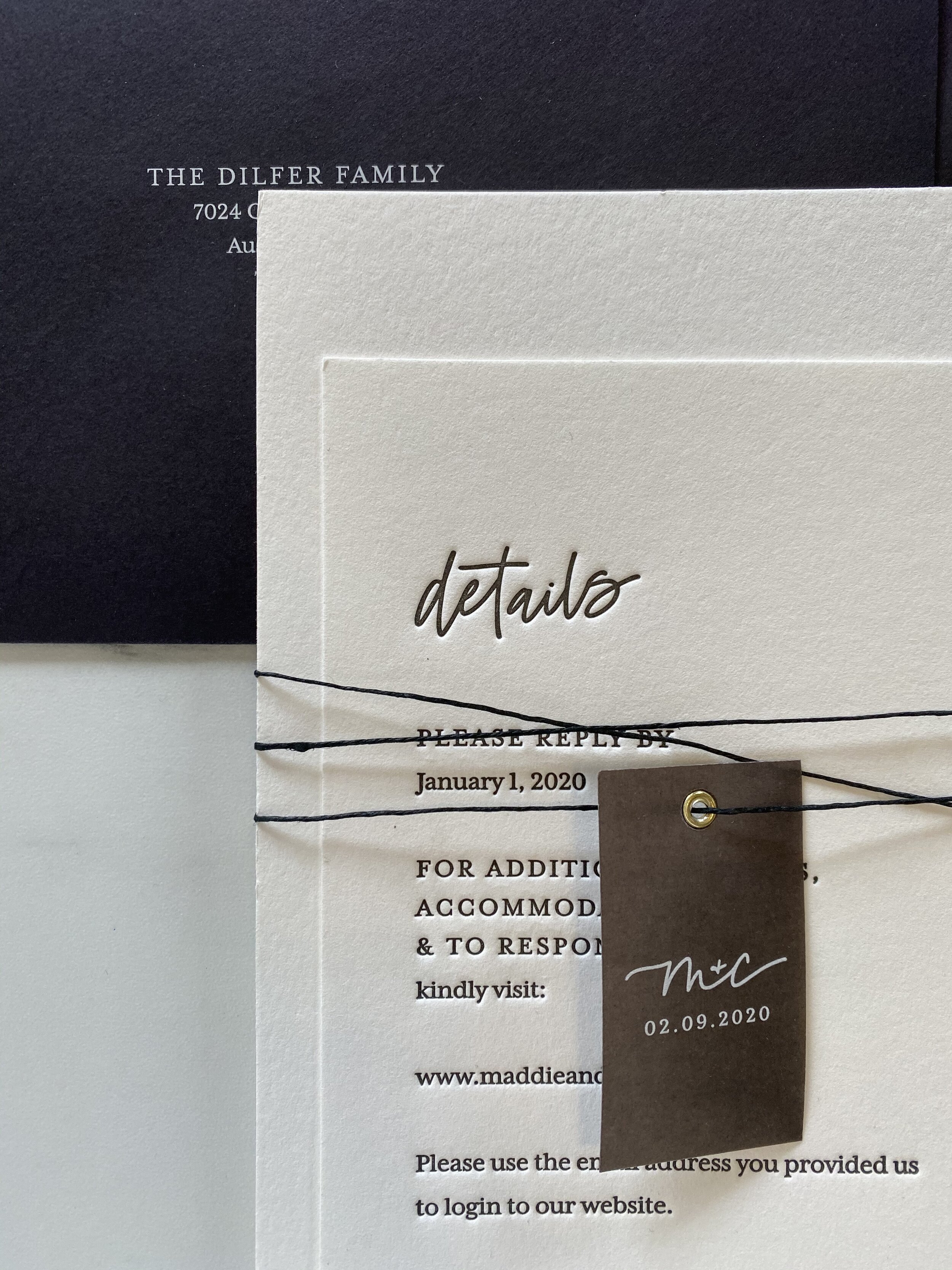
I gave the Monica font a sleek slant & varied lines, to create MONICA ITALIC.
Still a little more breezy than our other fonts, this style feels warmer than Monica, and gives an air of non-fussy elegance.
MONICA ITALIC is definitely a personal favorite of mine—you may recognize it from all over this website!
BEVERLY: dynamic & daring
The font style formerly known as “Springs,” the BEVERLY style embodies a joyful, carefree spirit.
When lettering with this font, I think fun because I get the utmost freedom in shape, size & interplay between all these elements.
WANT MORE?
CHECK OUT THE LATEST FROM THE STUDIO ON INSTAGRAM @FAWNLETTERING.
